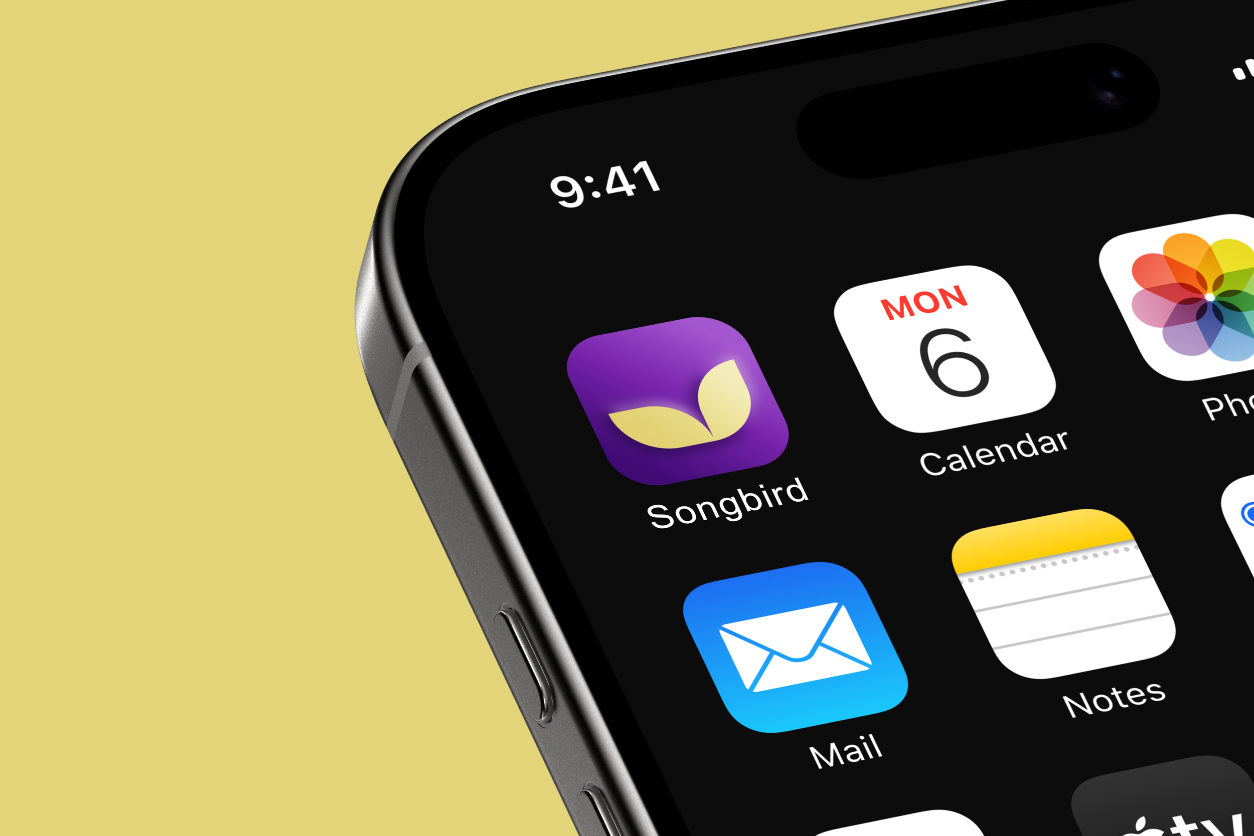
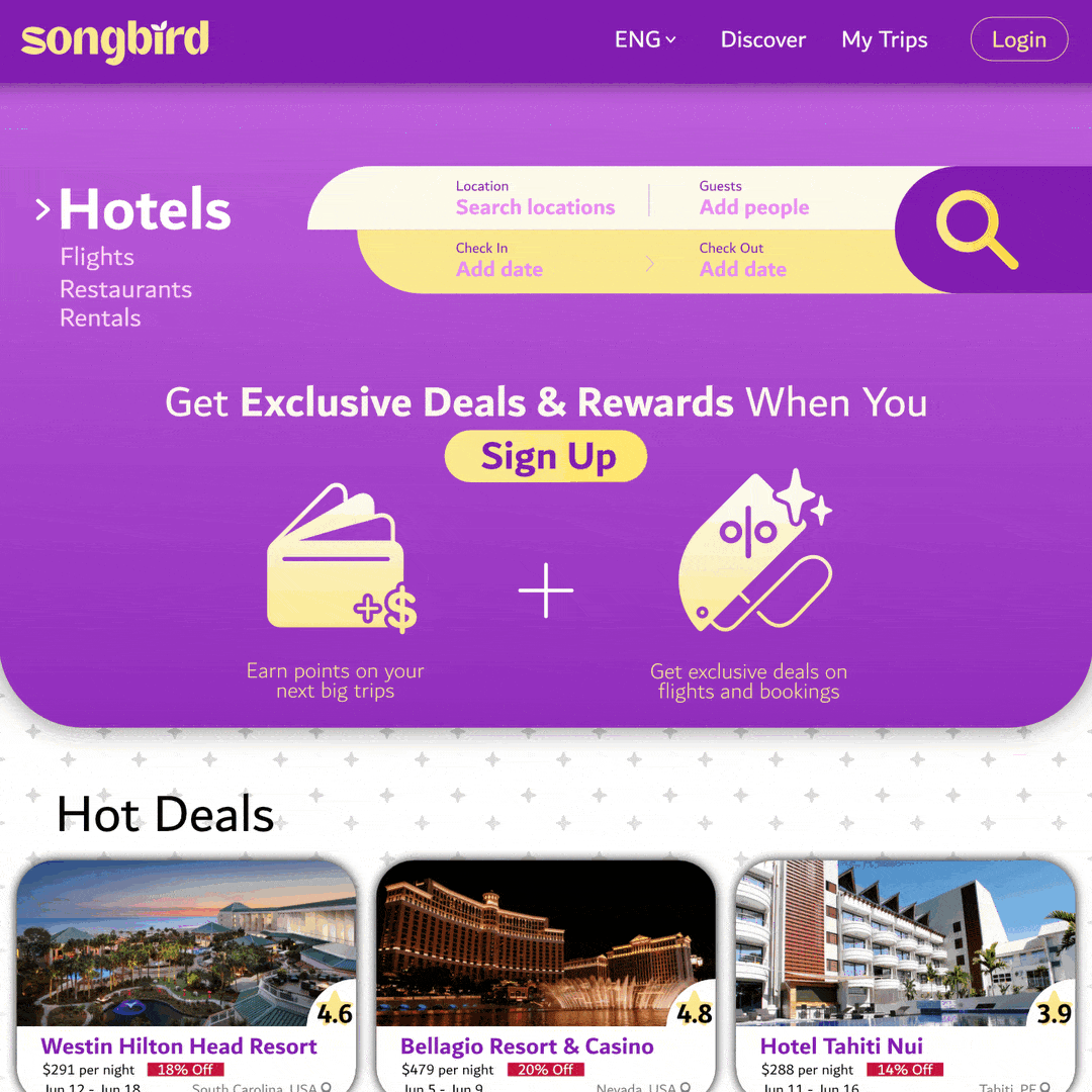
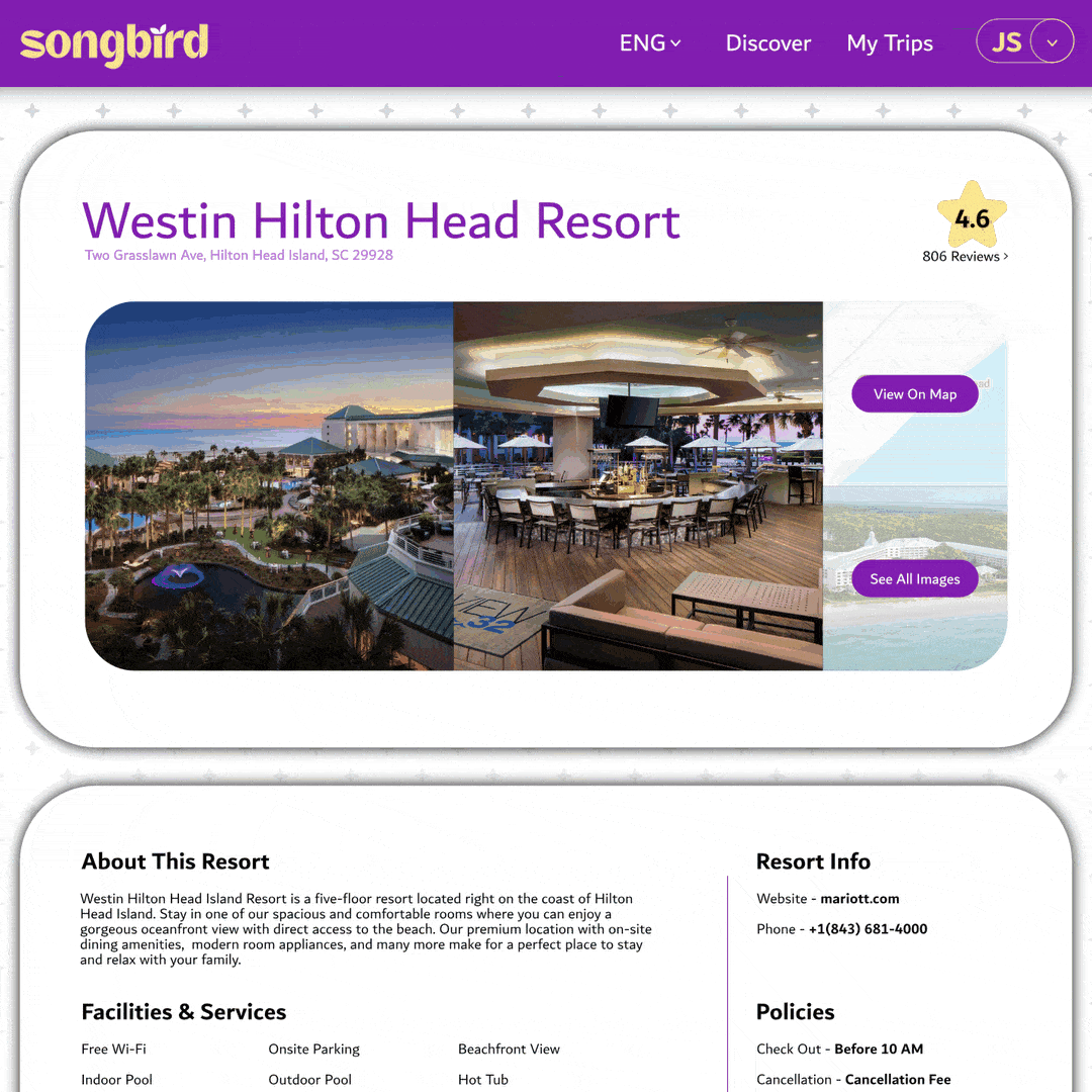
Songbird Travel Company
In this concept brand campaign, I was given the brief of creating an online travel company with an energetic appeal to it that would stand out from the competition, with the name Songbird. Using deep but vibrant purples and a yellow for contrast, I wanted to focus on catching peoples’ eyes. I wanted the shape language to reflect that as well, using the “wing” style shape found throughout the logo as an icon and to create interest on the user interface. I went further to showcase other examples you might see from the brand and made simple but effective billboard ads as well.